Kindling Candles
01 BRAND STRATEGY
02 BRAND IDENTITY
03 COPYWRITING
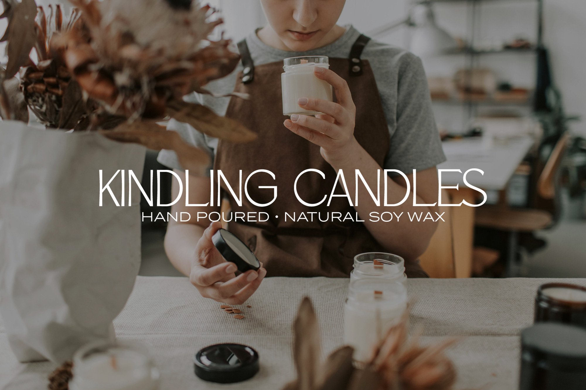
Kindling is a small-batch candle brand inspired by Australian country life. The brand needed an identity that felt warm, grounded, and evocative of nature — something that would speak to their connection to the land and their use of earthy, nostalgic scents like dried hay, bush honey, and campfire wood.
What I Did:
We began with a brand strategy session to define Kindling’s values, audience, and sensory personality. From there, I created a logo suite and identity system that pairs rustic charm with modern simplicity. The primary logo is strong yet soft, with a serif font reminiscent of vintage general store signage. Supporting icons and illustrations such as native trees were hand-drawn to reflect the brand’s artisanal roots.
The earthy colour palette was inspired by natural materials — think clay, ash, ironbark and golden grass. Paired with recycled textures and muted packaging mockups, the result is a cohesive brand that feels handcrafted, regional, and unmistakably Australian.
Why It Works:
Kindling’s new branding balances warmth and style, capturing the nostalgic calm of rural living while remaining contemporary and boutique. It gives the business a solid foundation to expand into wholesale, build a lifestyle presence, and stand out in a competitive candle market — all without losing its sense of place.